Maui ‘Oma Coffee Roasting Co.
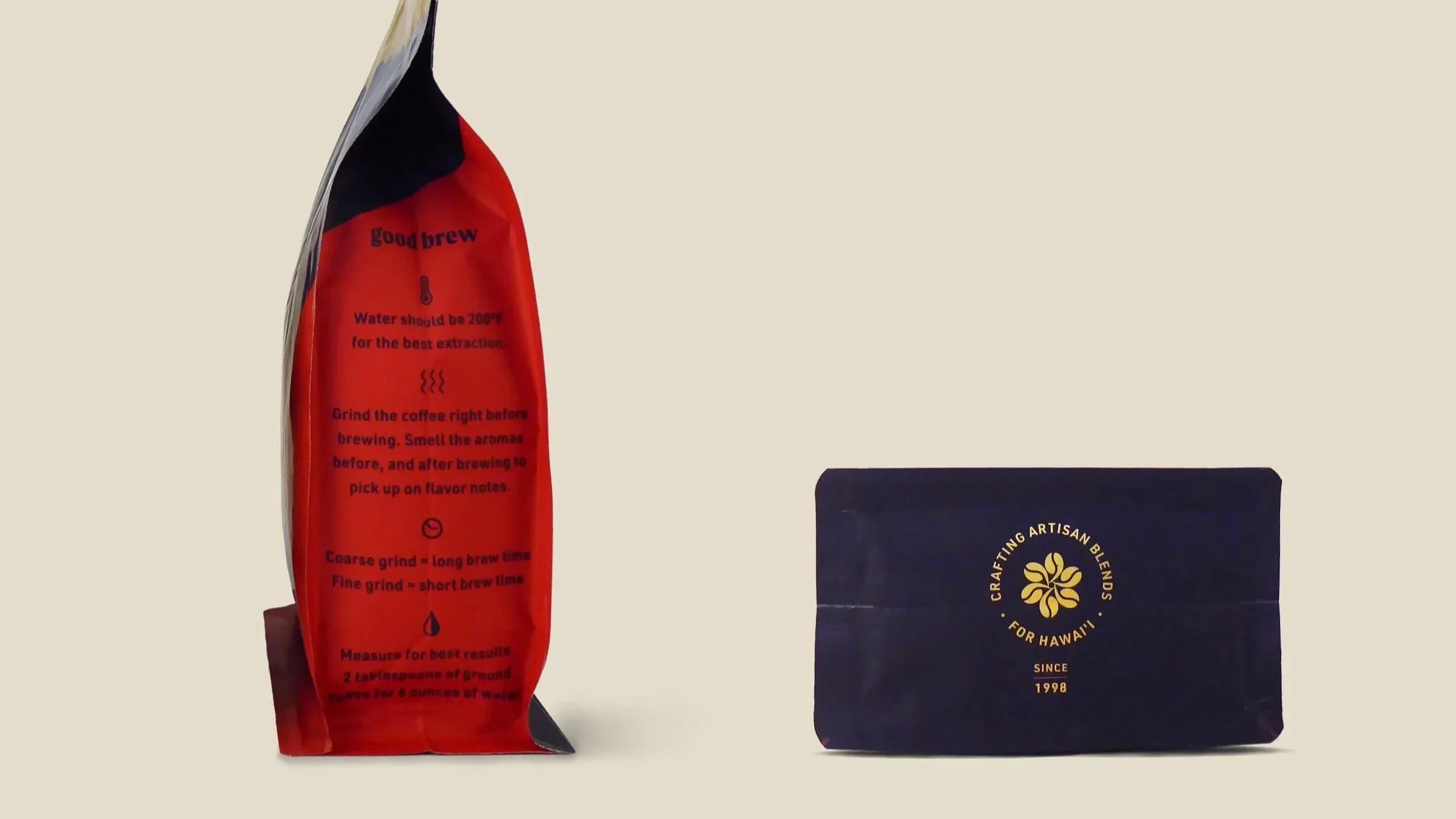
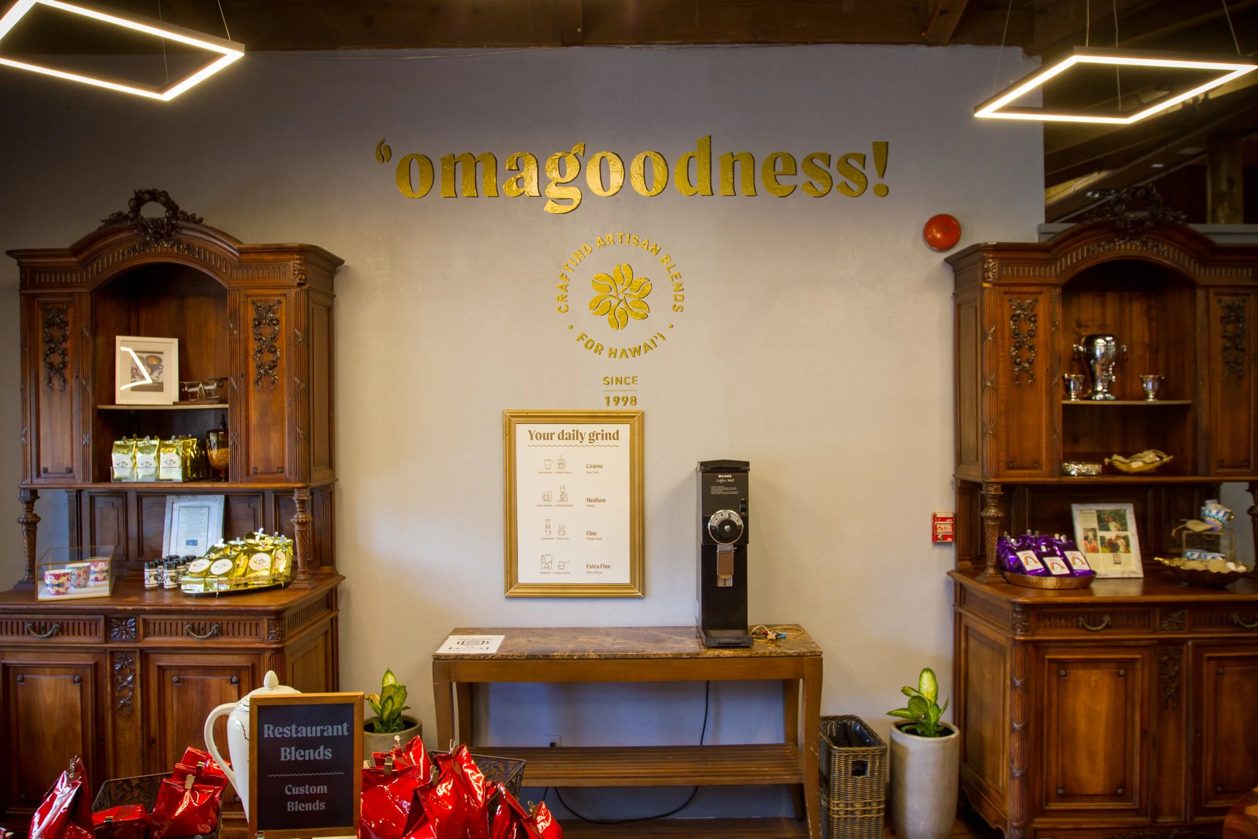
AN OVERHAUL OF THE BRANDING AND PACKAGING FOR MAUI ‘OMA started pre-pandemic. adversity led to adaptation, AND MAUI ‘OMA ENTERED the retail market, LEADING TO the launch of new brandING, packaging, a retail store, AN online store so much more!
‘Oma with the ‘okina, means, ‘to roast’ in the Hawaiian language, the ‘okina takES the form of a coffee bean.
THE ‘OKINA AS AN ELEMENT INFUSES A SENSE OF PLACE INTO THE BRAND IS A VISUAL ELEMENT THROUGHOUT.
The STEAM/ROAST icon is incorporated into a stylish detail. THE DIAMOND SHAPE BRINGS A CONTINUITY FROM THE ORIGINAL LOGO.
TO HELP THE CUSTOMER EXPERIENCE, THE COFFEE IS COLOR CODED INTO FOuR CATEGORIES: HAWAII COFFEES, HOUSE BLENDS, CUSTOM BLENDS, DECAFS & FLAVORED COFFEES. gold ACCENTS elevate the brand.


